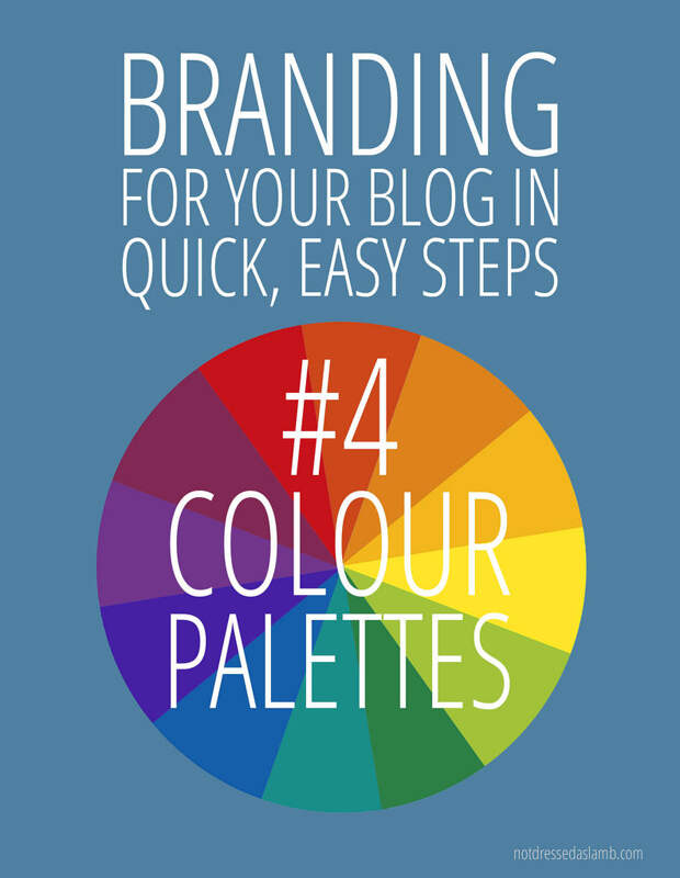
Time for part 4 of my blogging tips posts where I'm doing some quick, easy tips on branding for your blog! This week I'm talking about colour; it's as much a part of branding as everything else I've written about so far. Get the colours right and you'll be taking one more step towards a professional-looking, branded blog. So this week's tip is simple:
#4 THINK ABOUT YOUR COLOUR PALETTE
Why choose a colour palette?
Like choosing one particular font or using the same avatar everywhere, choosing a colour palette and sticking to it will give your blog that look of cohesion, reinforce you and your blog as a brand and make you more memorable and recognisable wherever you appear.
Take a look at these famous logos as examples:
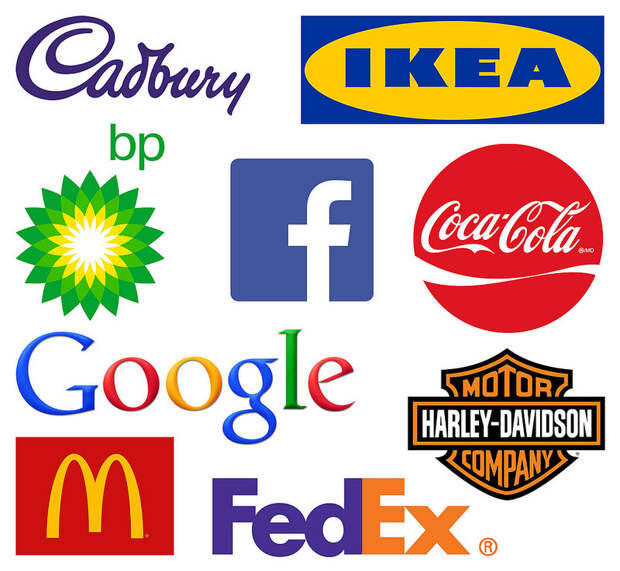
If you replaced the lettering on each logo with some other words you'd probably still recognise the brand. This is because the colours they use (and the fonts) are so synonymous with that brand that they're recognisable as shapes, colours and fonts only. For example, if I'm looking for Coca Cola in the supermarket shelves I can see where it is from the other end of the aisle because I know to look for a mass of red labels. The colour we associate with the most well-known cola brand is red - it has nothing to do with the colour of the actual product itself.
How does colour affect how we perceive brands?
This fantastic article The Psychology of Color in Marketing and Branding states the following interesting facts:
"Researchers found that up to 90% of snap judgements made about products can be based on color alone.
"Purchasing intent is greatly affected by colors due to the impact they have on how a brand is perceived. This means that colors influence how consumers view the "personality" of the brand in question.
"Our brains prefer recognizable brands, which makes color incredibly important when creating a brand identity... it is of paramount importance for new brands to specifically target logo colors that ensure differentiation from entrenched competitors (if the competition all uses blue, you'll stand out by using purple).
"Nearly every academic study on colors and branding will tell you that it's far more important for your brand's colors to support the personality you want to portray instead of trying to align with stereotypical color associations." - SourceRead the part about men and women having very different favourite colours. Bear this is mind if, like me, you have a mostly female readership.
How can I put that into practice on my blog?
You might be thinking that because you have a black text logo/header and a white background for your blog you don't need a colour palette. I thought that too, until I came to rebrand my blog and thought about all the things that needed tweaking and redesigning. Please note mine is still a work in progress - my colour palette isn't being put fully into practice yet, so I need to take my own advice here (it's on the to-do list).
There will be times you may need (or want) to choose a contrasting colour or two, even if your header and background are black and white respectively; for example:
- Text links that are a different colour to the rest of your body text to make them stand out
- Your Twitter background colour in your profile
- Dividing headers in your sidebar
- Your social media icons
- Your lead image on a How-To / DIY / pinworthy post (one with text overlay)
How do I get the exact same colours each time?
What you are looking for is the HTML colour code. You may think you don't know what they are but if you've ever seen a colour referred to as #489cdf, #c1b6ae or any other mixtures of letters and numbers (with a hashtag at the front) then that's your HTML colour code.
The website http://html-color-codes.info/colors-from-image will find the HTML colour codes from any part of an image on your hard drive. Below is an example of how it works:
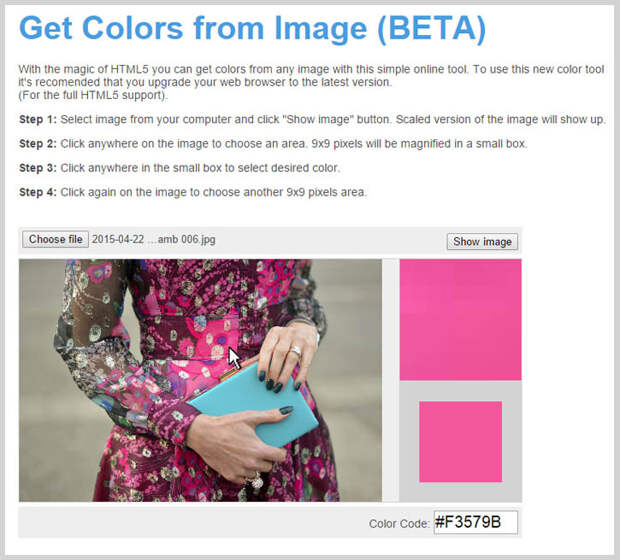
You can just play around and keep clicking certain areas until you find exact colours that you like. I've never been exactly sure what my own colour palette should be, so as an experiment for this post I took my avatar profile picture to choose colours. (I used the eye dropper function in Photoshop, but it's the same principle as html-color-codes.info.) I came up with six main colours from my avatar image:
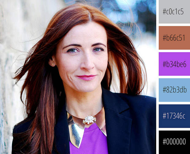
I now have a cohesive, definitive set of colours that I can use for all my images, text overlay, links, etc. As my avatar appears in the top right hand side of my blog and is usually prominent on all my profiles and social media platforms, it made sense for me to use this image to pick out colours.
As a group of colours I really like them - they're reasonably muted but they're a nice contrast to each other; as far as expressing my personality goes I think they do well to reflect the bright colours I wear (plus my red hair is represented by that warm ginger colour). I'll probably use them in groups of two or three, depending on where they're needed, and I'll continue to use the purple-magenta colour as the main accent colour (for example for links). As purple was also shown to be a top tier colour for women it's a good colour for me to continue using.
Don't forget you don't have to choose several colours like I have; two can be enough. As you can see above, Ikea uses two colours and Coca Cola uses just one - all to great advantage.
Do you have a colour palette already that you use - and how simple is it? Are you considering choosing colours to use consistently to brand your blog? Do let me know in the comments!


P.S. Like this post about branding? You might also enjoy Branding #1 Get a Favicon, #2 Use ONE Avatar or #3 Choose Just 1 (or 2) Fonts!
Linking up to: Let It Shine, Brilliant Blog Posts, Friday's Fab Favourites, Sunday Funday
